

30 new components avaiable
Show nowMARTA Mobility Flex
Enhancing Paratransit Services Through User-Centered Design
Team Members: Rachel LeRoy, Shelley Price, Mehmet Derya Ordu
Duration: September 2016 - January 2017
Skills: Service Design, Ethnographic Study, Wireframing, Prototyping, Usability Testing

MARTA Mobility is Atlanta’s paratransit service, providing ADA-compliant transportation for individuals unable to use the city's fixed-route transit system. During a period of leadership transition, our team engaged in a service design project aimed at enhancing the experience for both riders and schedulers. Through ethnographic research, stakeholder interviews, and usability testing, we identified key challenges and developed a rider-centric mobile application prototype. This solution aimed to improve transparency and flexibility in ride scheduling, ultimately fostering greater confidence among users and staff.
Problem
Riders and schedulers of MARTA Mobility were often left in the dark about the status and details of upcoming rides. This lack of clear, real-time information created uncertainty, anxiety, and frustration on both sides. Riders couldn’t confidently plan their day, and schedulers struggled to manage expectations and provide updates. The system's rigidity left little room for flexibility or adjustments, leading to a breakdown in trust and satisfaction with the service.
Process
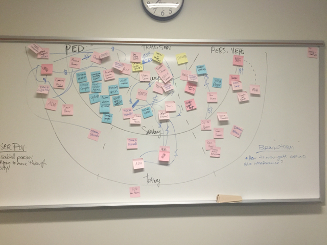
Our process began with ethnographic research and informal interviews to understand the lived experiences of riders and schedulers. From there, we developed a series of service design tools to map out key pain points and system dynamics. This foundation informed our creation of an interactive prototype, which we tested with users to gather feedback and validate our ideas. Alongside usability testing, we also crafted forward-looking recommendations to guide future improvements. The 5-minute video below gives a high-level walkthrough of our approach and the solution we designed.
Ethnographic Studies
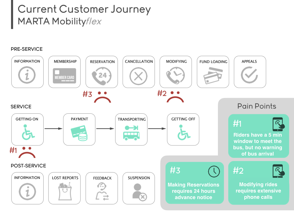
We began our research by exploring MARTA Mobility’s web presence, stepping into the shoes of a first-time rider who is someone new to the city, unfamiliar with the service, and attempting to register. This helped us surface initial barriers in the digital onboarding experience. As we prepared for our on-site visit, we sketched out early stakeholder relationship and customer journey maps to guide our inquiry. Once on location, we toured the facility and spent the afternoon immersed in both front- and back-end operations. We spoke with the program director and informally interviewed key staff members, including schedulers, maintenance workers, managers, and driver trainers. To deepen our understanding, we also joined a ride-along with a bus driver, observing real-time interactions and speaking directly with riders about their experiences.
Service Design
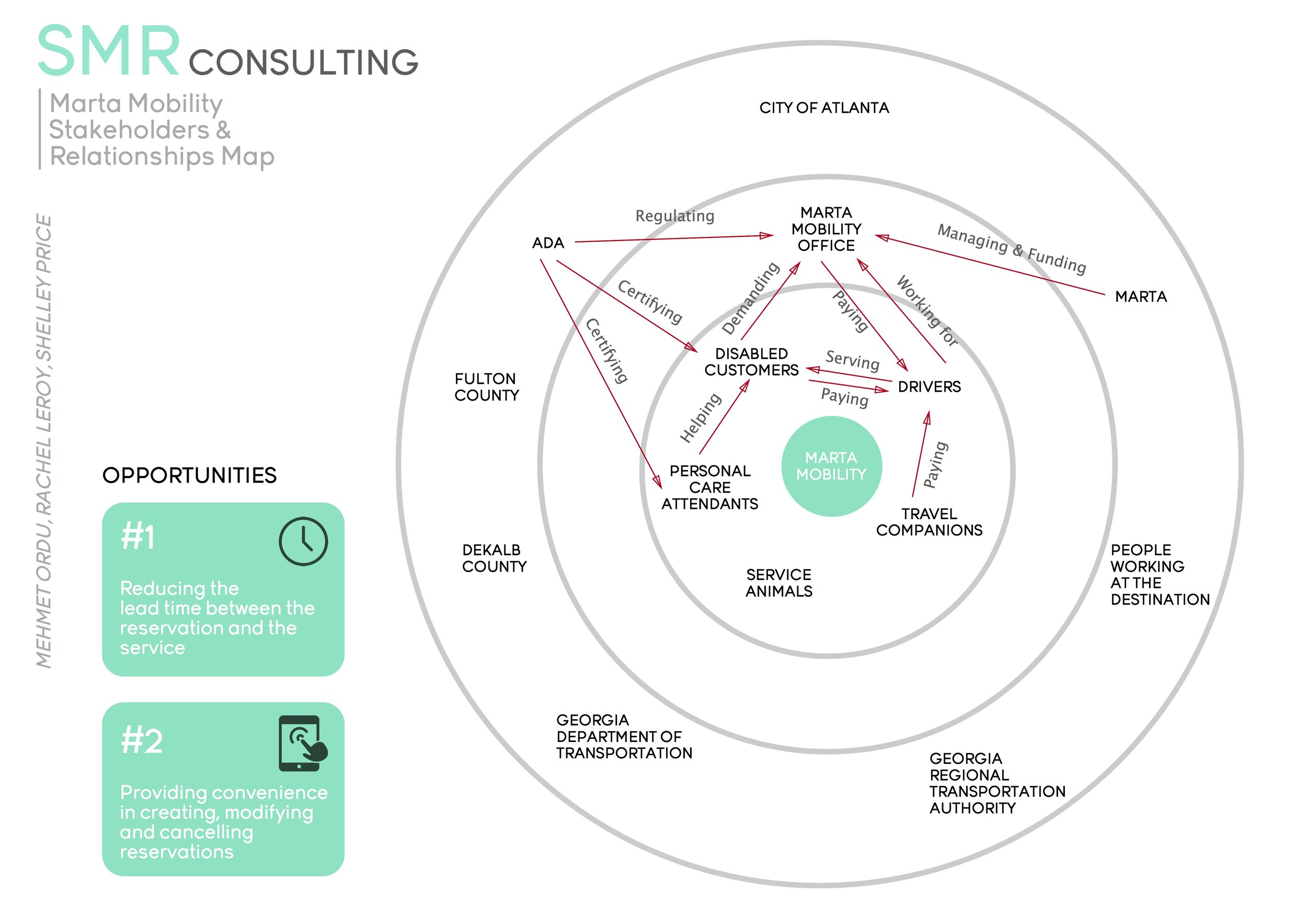
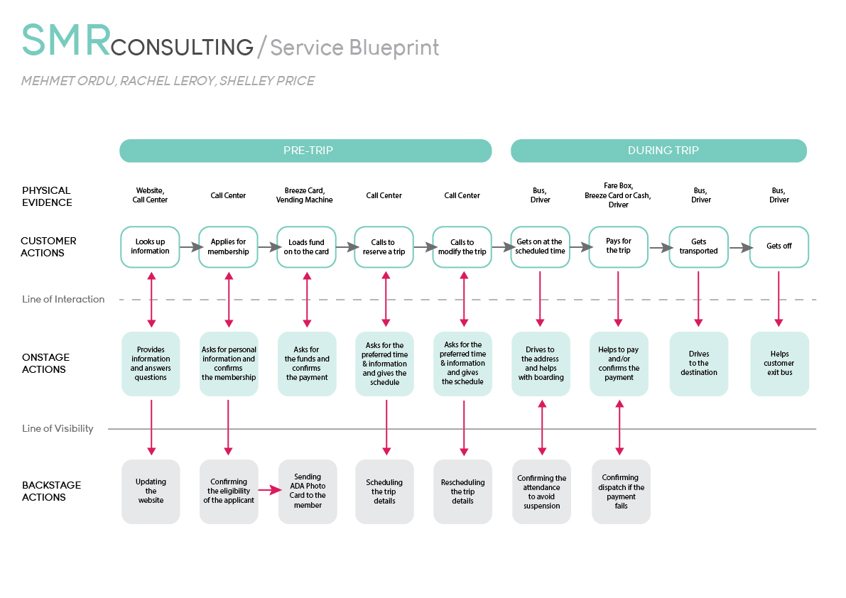
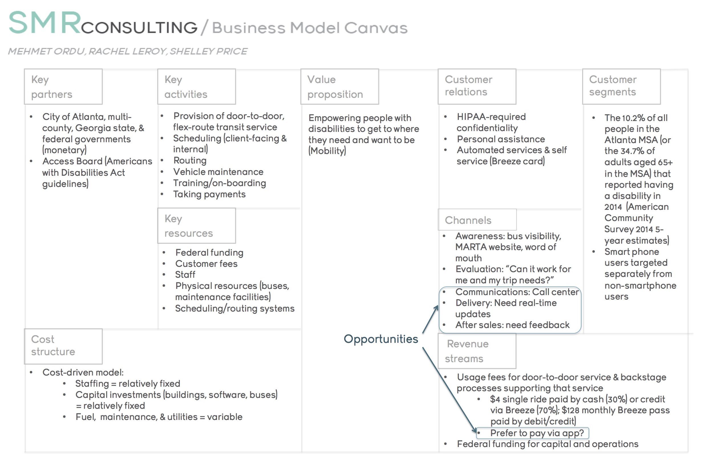
Building on our observations, we refined our stakeholder map and customer journey map, and created a current-state service blueprint to capture how the system was operating. From there, we developed a business model canvas and an opportunity matrix to identify key areas for improvement. We then moved into future scenario development, crafting detailed passenger personas and narratives to explore potential solutions from the rider’s point of view.
Defining Focus Areas
After documenting the environment and mapping out both customer and employee touchpoints, we set out to improve key aspects of the MARTA Mobility service. To stay focused and within scope (especially during a time of organizational transition) we prioritized two actionable opportunities that could provide immediate relief to both riders and staff:
- Reducing lead time between scheduling and taking a ride
- Making it easier to create, modify, or cancel trips
We tackled lead time first, as it was a shared frustration. Riders were required to request trips at least 24 hours in advance, ideally three days ahead, due to the highly manual scheduling process. Schedulers were creating routes by hand, often having to rework the entire fleet’s schedule multiple times (sometimes up to 3 or 4 revisions in a single day) leading to inefficiency and burnout. We also addressed the lack of convenience in booking and managing rides. The entire system relied on phone calls (no apps, no digital tools, no automated confirmations or updates). Riders gave detailed trip info, but in return only received a vague 1-hour pickup window, during which they were expected to wait and be ready within a strict 5-minute boarding window. No reminders were sent, and riders were left to manage this all manually, adding to the stress on both ends.
Solution
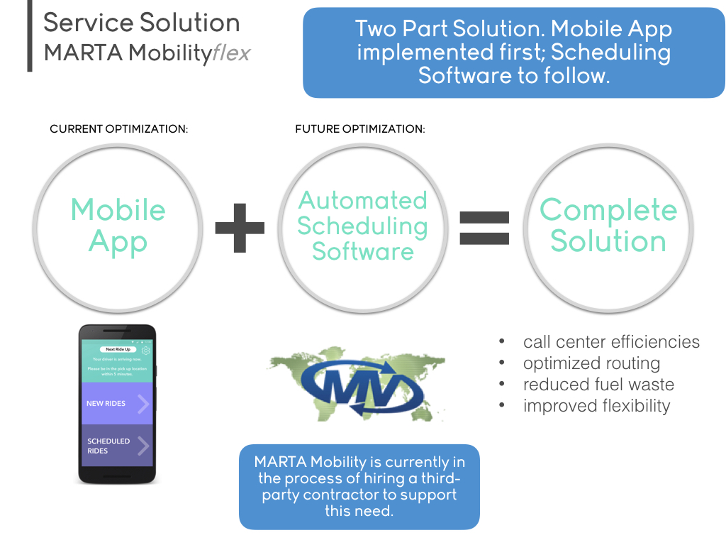
Anticipating that the new management company would soon implement automated scheduling software to reduce lead times, we focused our solution on keeping riders informed and minimizing missed rides. Our goal was to improve transparency around estimated arrival times while also introducing a digital method for scheduling rides: boosting convenience for riders and easing the burden on schedulers, who could now spend less time answering phones and more time refining schedules. With the broader system in view, we chose to design a mobile app prototype. Since riders were already used to using their phones to call in trips, transitioning to a mobile interface felt like a natural and accessible step for much of the user base. Still, this direction wasn’t without its challenges. Our ethnographic research revealed that MARTA Mobility serves a wide range of users with physical, visual, and cognitive disabilities, some of whom either couldn’t use or didn’t own smartphones. However, after speaking with riders and confirming with the program director that many did, in fact, have access to smartphones, we moved forward with the mobile app, acknowledging that it may not serve every user segment in the early stages, but could be a meaningful first step in improving the experience for a significant portion of riders.
Storyboard
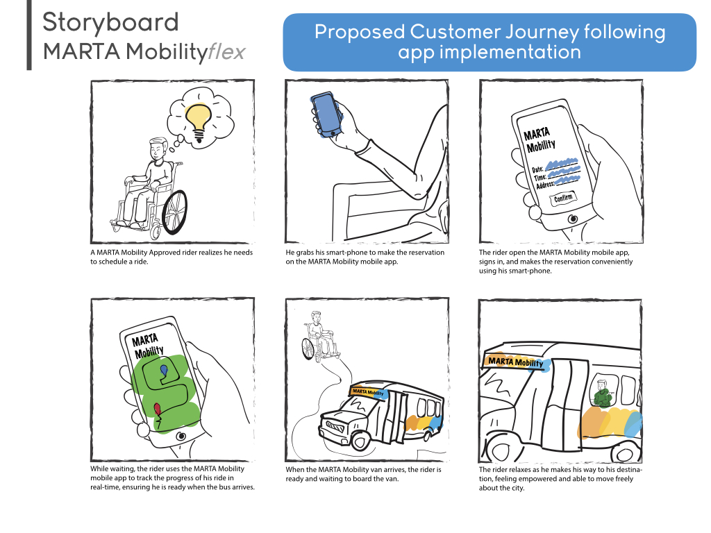
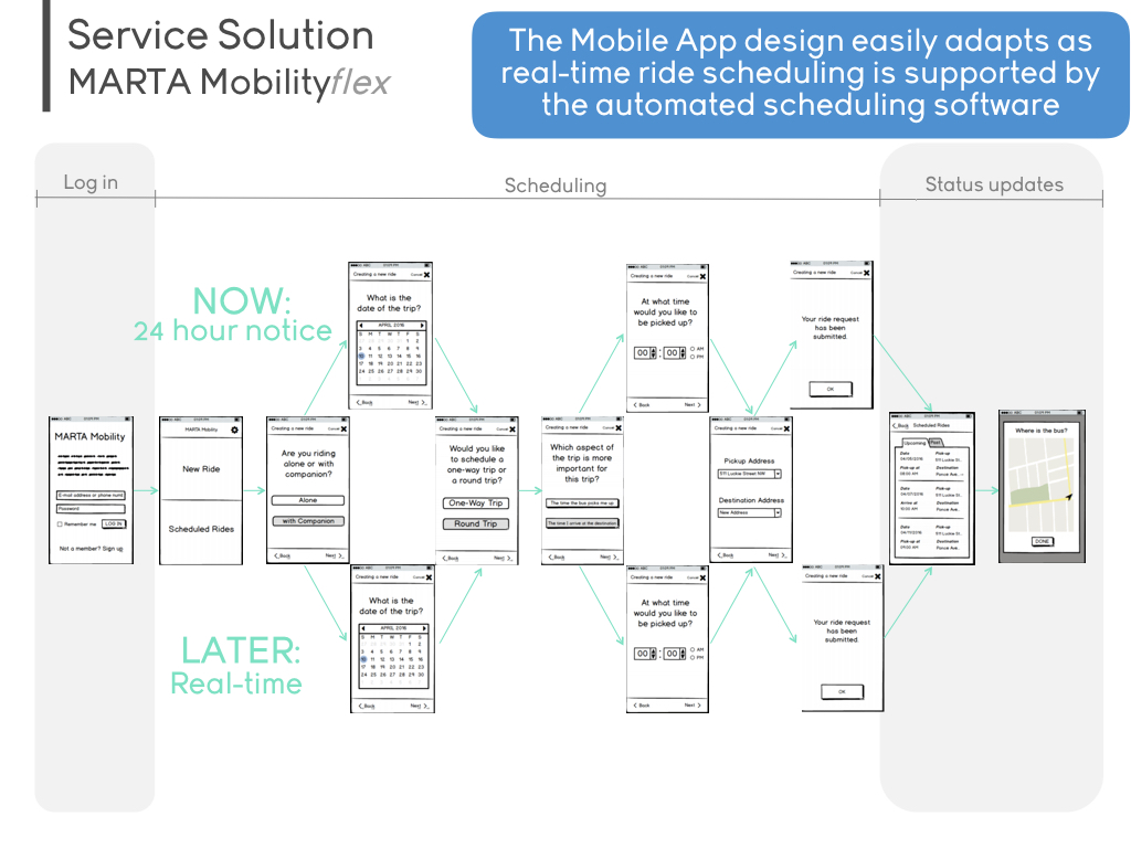
The app was designed for immediate use within the existing system, providing a practical solution that could launch quickly while still offering real value. At the same time, we laid the groundwork for future enhancements, anticipating a more sophisticated back-end system down the line. The storyboard below outlines how the app could evolve, with the most significant upgrade being real-time ride scheduling and modification as the system matures.
Wireframes & Prototypes
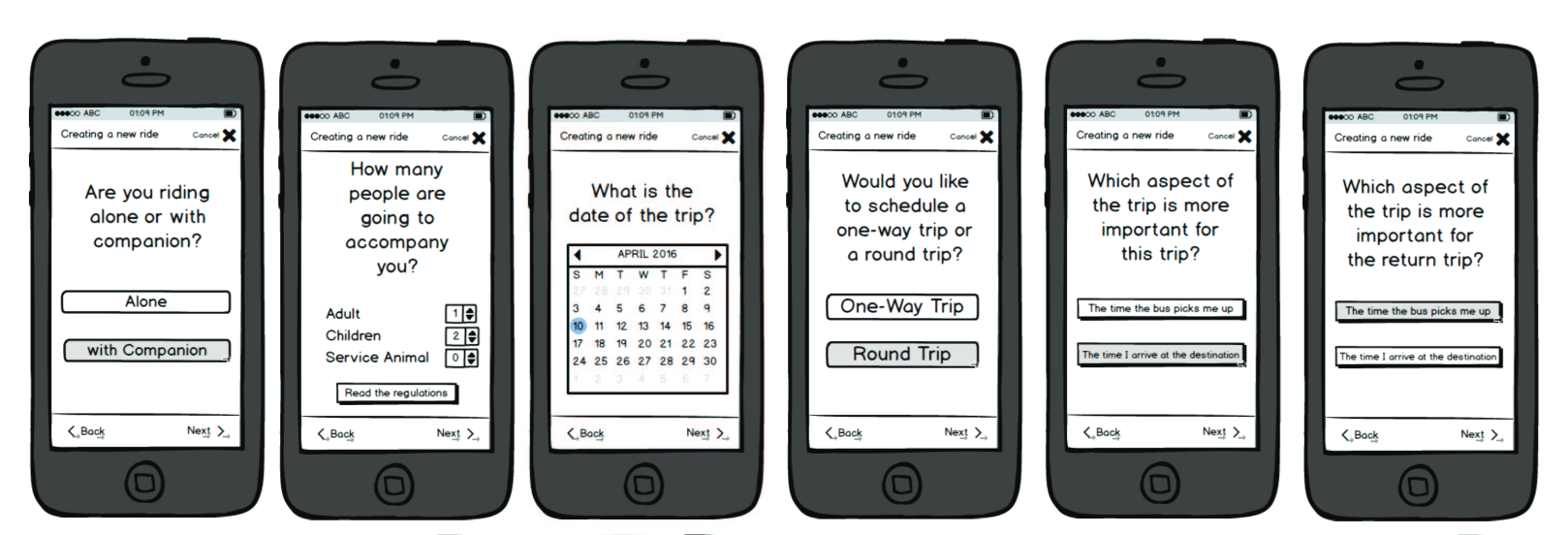
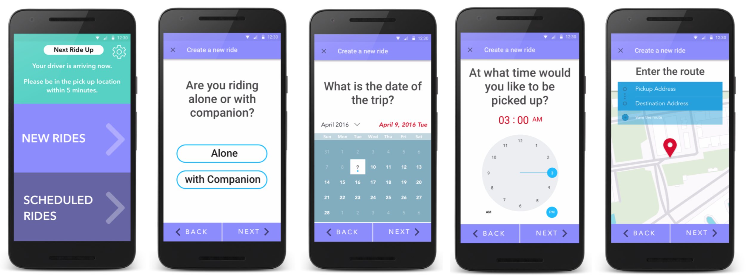
We created two versions of the mobile app prototype: first, a low-fidelity interactive version in Balsamiq, and later, a higher-fidelity version with wireframes designed in Sketch and interactive flows built using POP (Prototyping on Paper) by Marvel.
Usability Testing
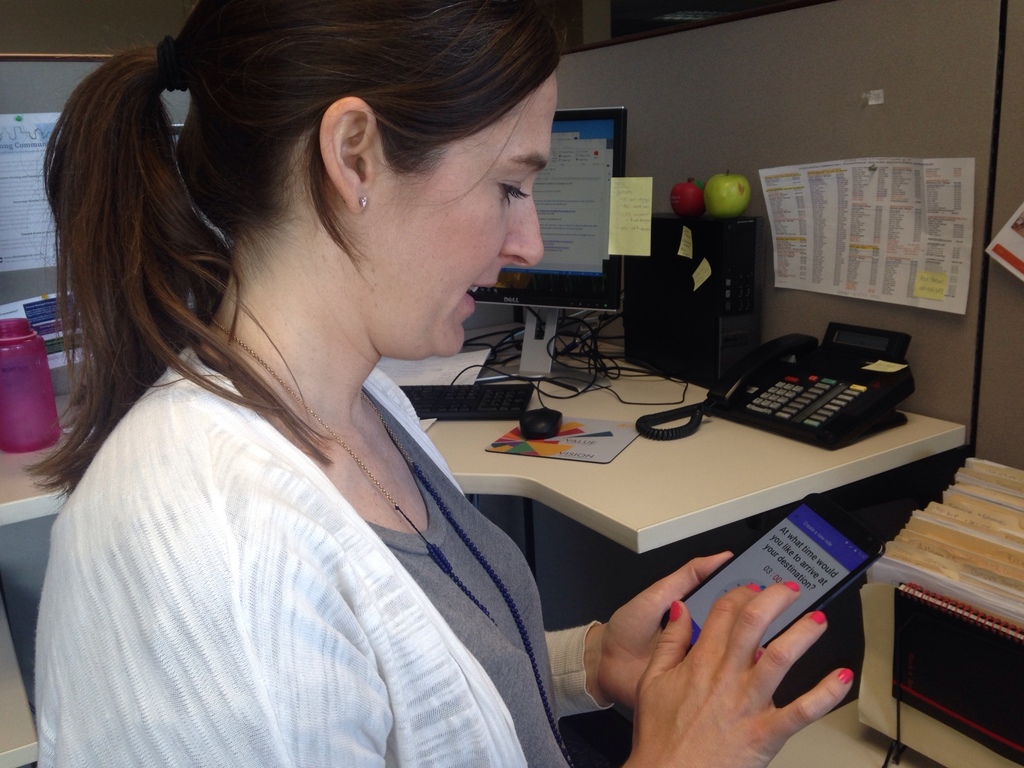
We tested our initial black-and-white prototype with six expert users, including one actual MARTA Mobility rider. These experts specialize in public transit, aging, and disability. Their feedback helped us refine the logic and usability of our screens before moving on to the high-fidelity version. One major suggestion was to remove the MARTA Mobility application process from the app as it added unnecessary friction and didn’t make sense until MARTA digitizes the entire service. Another key change was simplifying the language. Originally, the app asked riders to choose between “the time the bus picks me up” or “the time I arrive at the destination.” While we aimed for a natural, conversational tone, testers found the phrasing long-winded and confusing. We revised it to the much clearer and more standard: “depart at” vs. “arrive by.” Other insights led to technical improvements, like adding auto-fill to reduce typing for users with physical disabilities and swapping out a tap-to-select time input for a scrolling interface based on a user’s feedback that scrolling was less physically taxing than repeated taps.
Reflections
Looking back, this project felt like getting dropped into a moving bus and being told to redesign the route while it was still going. We weren’t just designing a mobile app but we were trying to understand a whole system, dealing with bureaucracy, new management, and limited resources, all while keeping the real users in mind. There were times we thought we had a great idea, but then realized we were designing based on our own assumptions instead of what users actually needed. That was tough to admit, but really important. What stayed with me most were the real stories we heard. The ride-alongs, talking to people, seeing how the service worked in real life which made everything feel more real. It wasn’t just a design project, it was about people. We made mistakes, learned from them, and kept moving. Somewhere along the way, we became a real team. We weren’t just building a product, we were trying to make a service better for people who depend on it every day. And that kind of work sticks with you.
© DESIGNED by MEHMET DERYA ORDU | 2025